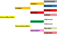
The KISS principle came to mind when I observed the latest genealogy meme. Attributed to US genealogist J Paul Hawthorne folks are colouring their pedigree charts according to place of birth, or sometimes other attributes like cause of death.
It's a simple way to get an insight into your ancestry, useful for comparing to DNA ethic origins results. I've seen the same thing done previously with national flags, and even used it myself.
You can make a chart by hand, although I read with the current craze for adult colouring books coloured pencils are in short supply. Most are using a spreadsheet. I used a basic Excel sheet for this four generation chart of my father. For something a little more fancy use this Google docs sheet, click Make a copy under the File menu item to make an editable copy. Enjoy.

Did you say edible copy? Cheers, BT
ReplyDelete